Blog-Layout
Fascination and Challenge of Referencing Color Cosmetics
Daniela Louise Heinemann • May 01, 2020
Why color cosmetics is beyond color and about the processing power of the human brain.
The majority of color cosmetics is more than color – It is about color, appearance & coverage. Our brain is processing a lot while assessing the appearance of a colorful product.
The range of color cosmetics is huge. Online shops and the shelves of retailers all over the world are filled with inventive shade names and a variety of finishes leave almost nothing to be desired. Consumers are spoilt for choices to find the perfect product for their looks. And while finding the right shade is one side of the story (oh yes!), there is this „first sight“ impression we have from a colorful product, that impacts the try-and-buy decision.
Depending on the consumers' first touchpoint with the product, they will either see a digital swatch online, a printed color dot on the shelf, or a packaging, which represents the actual product shade. Or they are in front of the shelf and see an inspiring bulk color that grabs their attention. Seconds later the actual product application can be surprising … Surprisingly different.
There are basically three factors that influence the color of a cosmetics product: Color, Appearance, and Coverage. The color impression can be significantly influenced by appearance factors. For instance, there is this nice greenish pressed powder eyeshadow which reveals color-changing particles once it is applied and the light can be reflected from different angles on the skin. Or this vivid orange lipstick bulk which turns out to be low in coverage and therefore interacts with the natural lip color, leading to a beautiful but different shade.
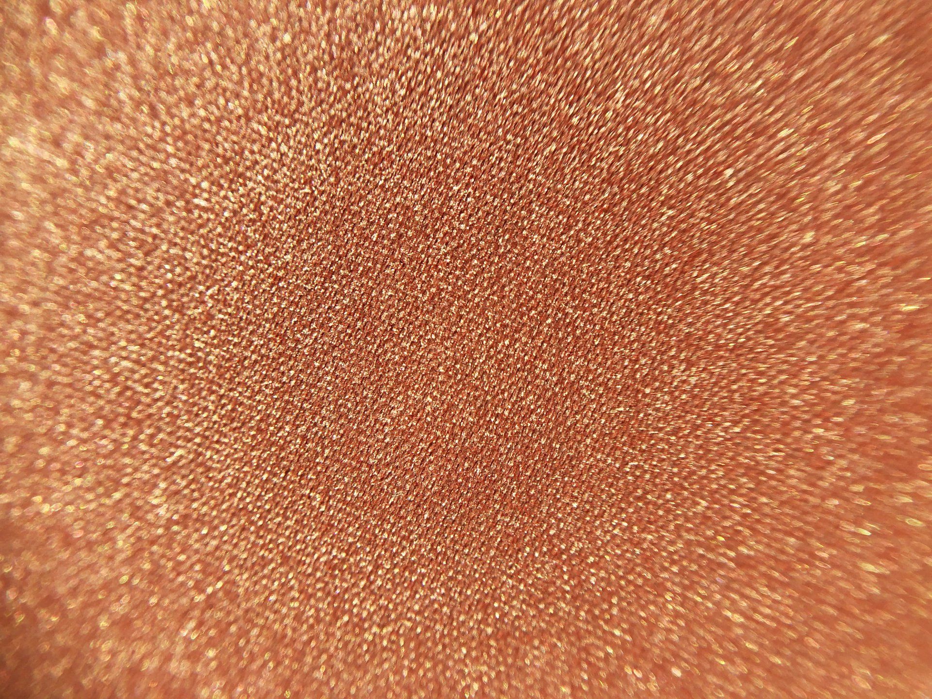
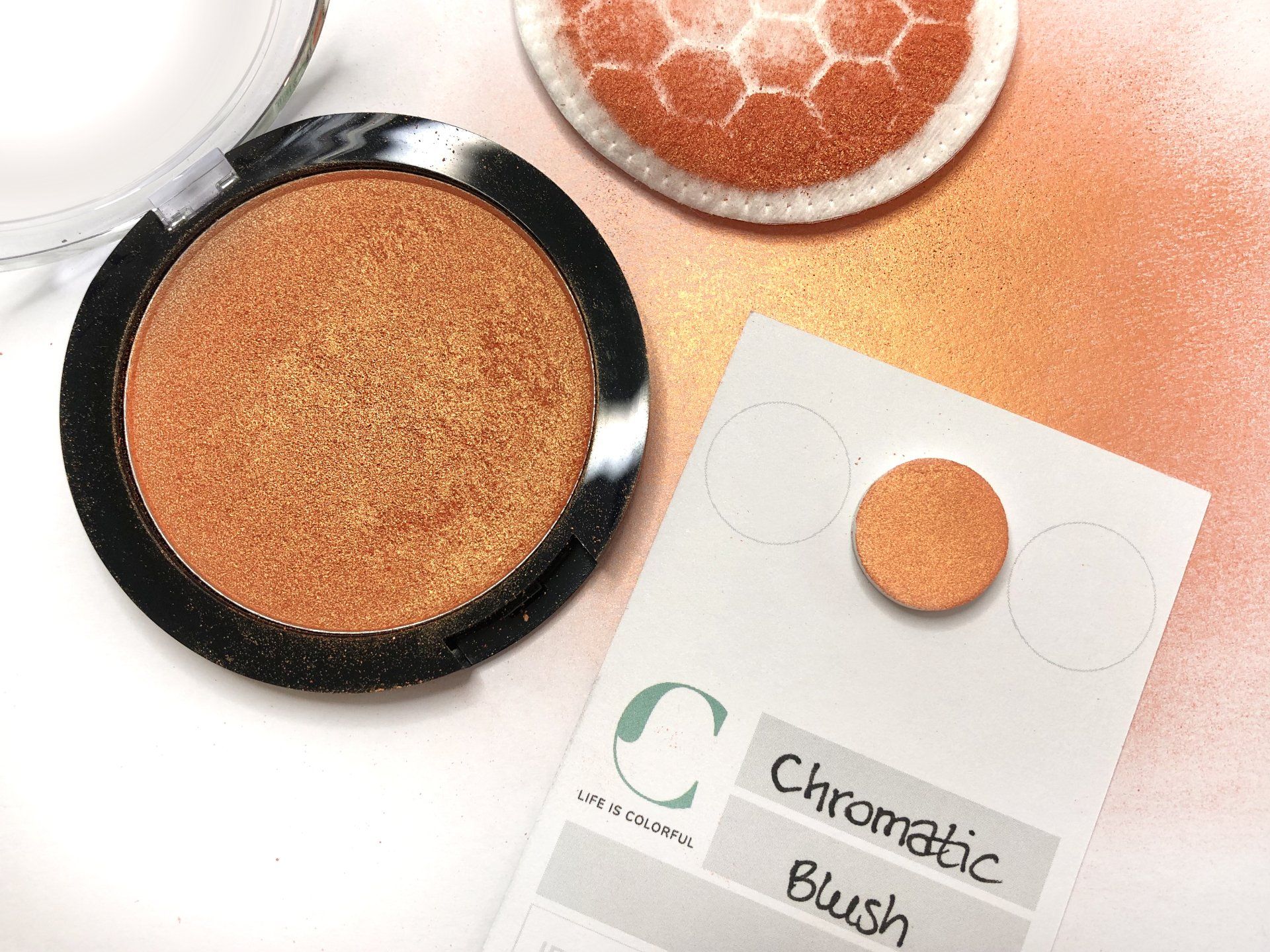
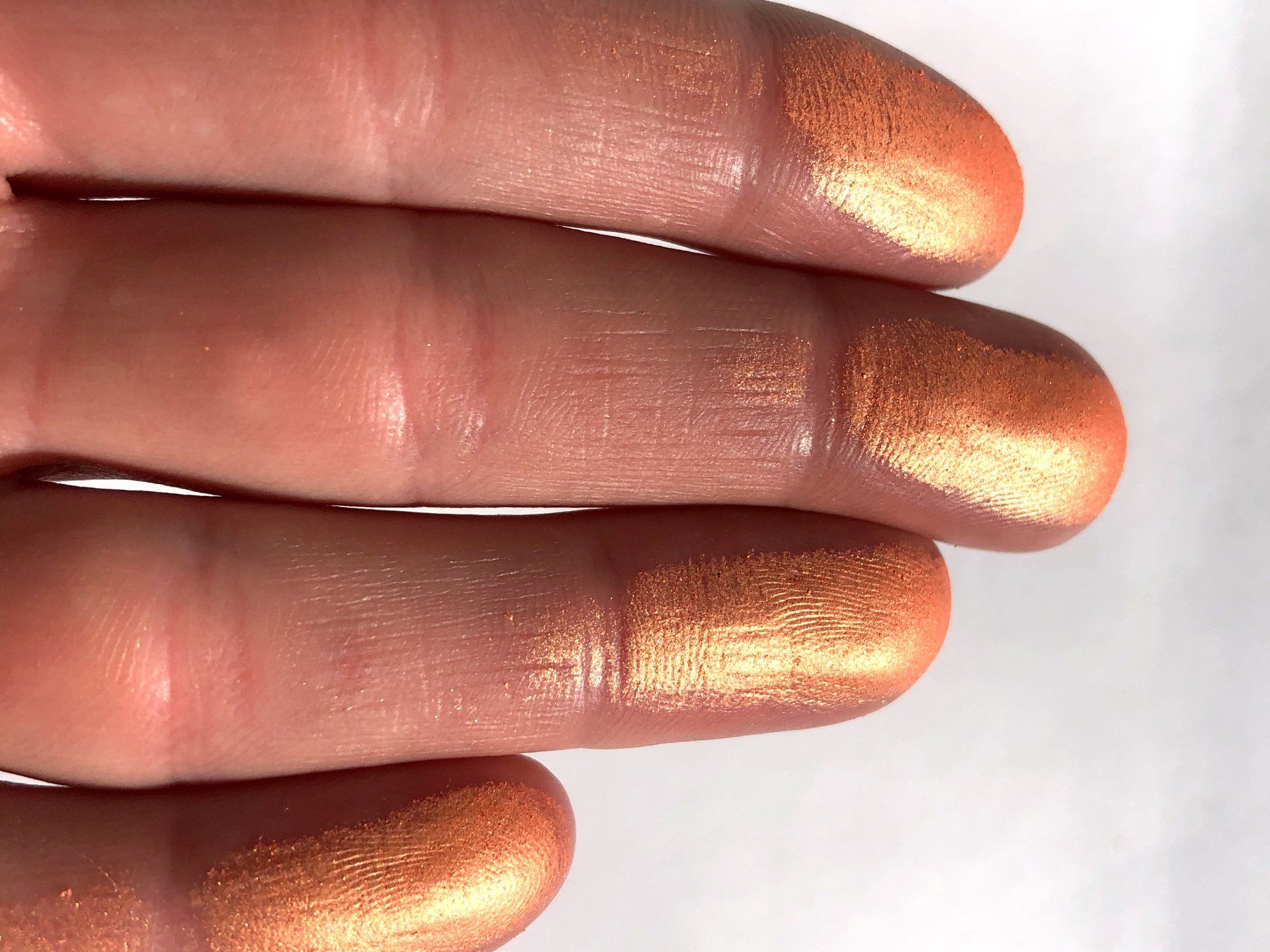
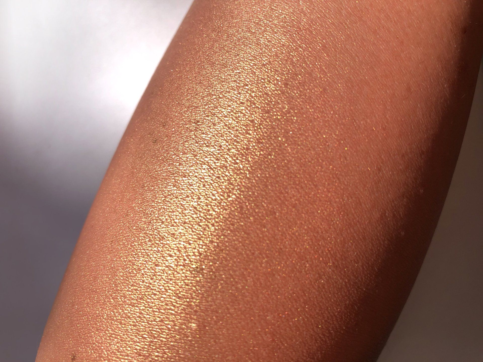
I also found this nice chromatic blush, which I examined and photographed in detail in the picture series below. Do you see the range of colors the product reveals, depending on the angle and the intensity of coverage? It is interesting to see what happens, when the product is applied on the skin and flat surfaces vs. this nice fluffy cotton pad, where the reflection/absorption reveals a different color impression.
The overall question is: What is the „real“ color of the product? How can a consumer be more certain about what color to expect? Our brain is processing a lot while assessing the appearance of a colorful product in real life. How can this be covered technically with regard to standardized color measurements? And equally for a variety of product types such as powders, creams, liquids, pens? To reduce all color and appearance factors down to one single color value to be communicated on all possible consumers touchpoints is challenging.
We love this challenge! The goal for LIFE IS COLORFUL is to simulate the human eye and the processing power of the human brain when referencing the color of a product and to get the most realistic, accurate, and reproducible color value for color communication.

ABOUT THE AUTHOR
Daniela Louise Heinemann is the Founder of LIFE IS COLORFUL. Color is her passion for more than a decade and the company name represents her attitude and approach to life. She is inspired by the beauty of nature, design and creativity & motivated by the almost endless opportunities our daily life offers. When she is not working on color topics somewhere in the world, she is likely creating a new recipe in her kitchen, out for a bike ride or dancing her energy off in her salsa shoes.
MORE RECENT ARTICLES
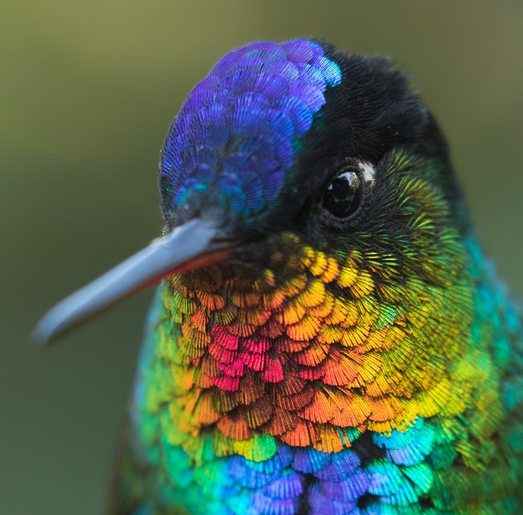
A stunning photograph from a tiny bird with iridescent feathers.
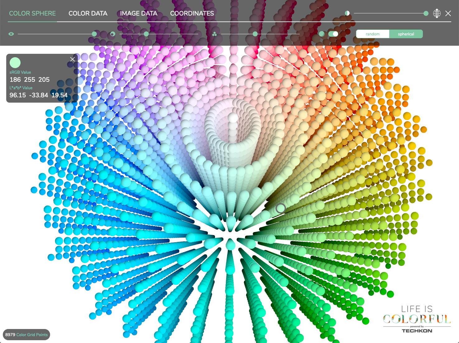
The evolution of color pickers & how to pick colors today.
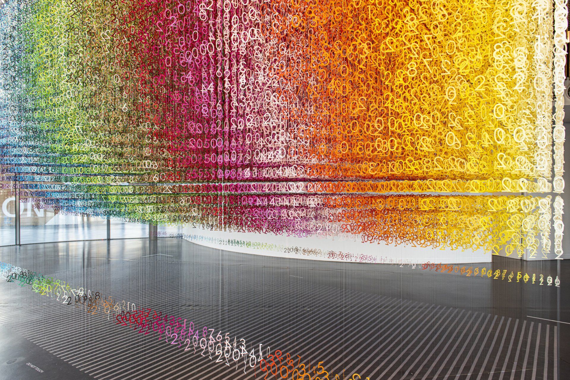
An installation series where the essence of every carefully considered color can be appreciated.